Are you ready to
Get SHIT Don3?
Are you ready to
Get SHIT Don3?
...Yeah So Are We.
First Things First…
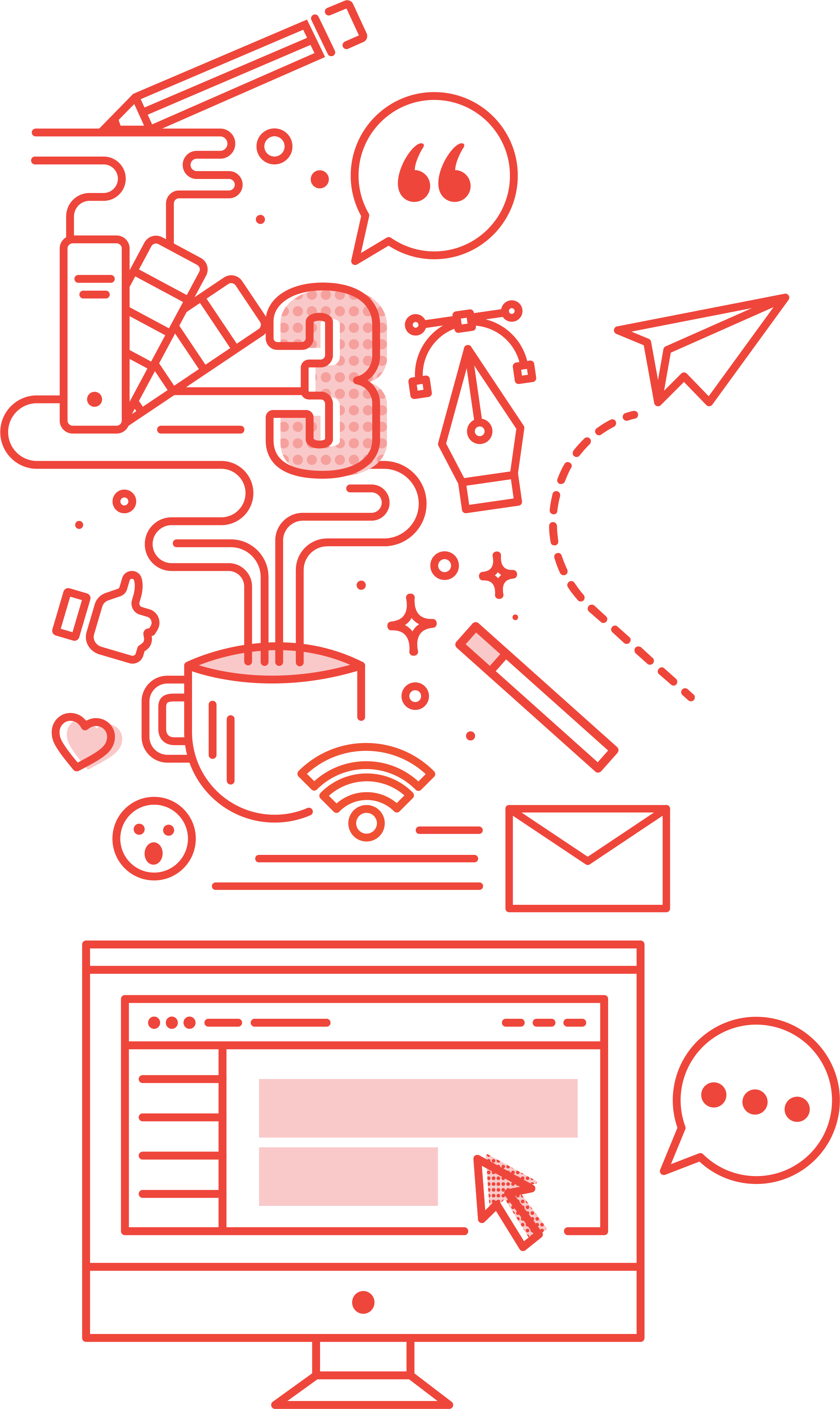
What’s Behind Door No. 3
A creative design studio that will dazzle your pants off.
No, it’s not a pair of jet skis or an all-expense paid trip to Tallahassee. We like to believe it’s something better. Behind Door No. 3 is a creative design studio you can actually trust to get the job done well…in a timely manner…and on budget. Crazy, right?
Whatever your needs are in the print, digital, or presentation space, we promise brilliant, effective communications that surpass your expectations and dazzle your audience every single time. Ok…so maybe not better than a free pair of jet skis, but definitely better than a lifetime supply of Rice-A-Roni®. Seriously, who needs that much flavored rice?

Meet Your
New Best Friends…


Jenni
Don't Play No Games

Eileen
A Grandma At Heart

Emily
Casual Friday Enthusiast
What We
Bring to the Table
Besides ya know, coffee
UNRIVALED SERVICE
We are humans! And cool humans at that. No robot operator when you give us a ring… we actually pick up the phone when you call, respond to your emails in a timely manner, and frankly are just fun to work with in general.
PUSH BACK
Do you want to work with a team who only wants to make you happy or a team who is willing to push boundaries to make your project the best it can possibly be? That’s what we thought! We are not yes men. We are your team. We work collaboratively with you to find the best design solution for your project.
EFFECTIVE DESIGN
Creative design is a given, but giving a project life…and a voice…and meaning is a whole other beast. We don’t just make it pretty…we make it work! Who is your audience? How are you reaching them? How will this morph in the coming years? We ask the necessary questions to get you the absolute best results.
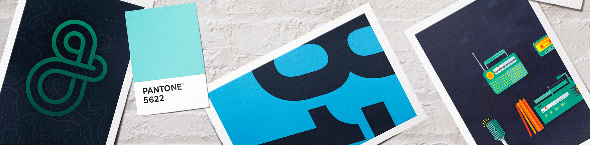
Shit We Do For Money
Learn what we don’t do on our services page
Visual Conceptualization
PowerPoint Presentations
Keynote Presentations
Content Development
Copy Writing
Logo Identity
Brand Collateral
Brand Guidelines
Package Design
Publication & Print Design
Advertising & Marketing
Print Ads
Infographics
Custom Iconography
Wix Websites
WordPress Websites
Web Maintenance
Web Banners
Digital Marketing
Reporting & Analytics
Trade Show Graphics
Event Collateral
PSSSSSST…WE ARE PRETTY GOOD AT IT TOO
Previous Years: 2020, 2019, 2018